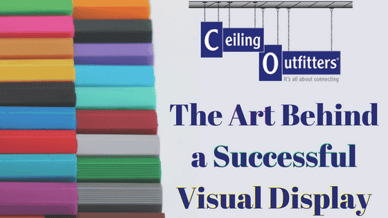
No two ceiling signs are created equal. The size, color, typeface along with other design elements of a sign matter a great deal. Even the subtlest of details have the potential to make a monumental impact on customers’ perception of the business, its offerings and influences their buying decisions.
Results from several studies shows retail signage is very effective at influencing and driving sales. Shoppers remember effective sign advertisements as part of the total in-store shopping experience. This is proof that the visual impact of a sign can inspire prospects to interrupt their normal course of activities to peruse a business’s offerings. Here’s a look at five of the most important aspects of ceiling signs that are critical in the quest to effectively communicate your value proposition and attract as many customers as possible.
1. Improve Readability Through Contrast
The best ceiling signs invite reading or at least a brief scan. Shoppers don’t read the sign, they read the words. Easy reading is made possible through many different strategies. Chief amongst them is contrast. Make use of a solid background color and generate. contrast with graphics or text of another hue in the foreground. The juxtaposition of different colors will prove visually appealing, inspiring people to look at the sign and take notice of what it is promoting.
Color contrast makes such a powerful impact that it helps boost customers’ retention of the sign details: the message, the brand, the company’s logo design. So, avoid use of the same color or color family and, opt for at least two contrasting colors. Use one in the foreground and the other in the background and your sign will attract plenty of customers.
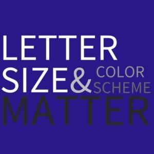
2. Letter Size is a big Deal
Larger letters are ideal as they are easy to read compared to small or moderately sized letters. The same is true for graphic visibility. When in doubt, go big. Large letters and graphics are key for signs that are viewed at a distance. In general, use a font size of one-inch for every 10 ft. of viewing distance. Letters that are up to 10 inches in height will provide optimal impact at 100 ft. away.
 Furthermore, the size and style of typeface plays a major role in the audience’s ability to read the sign’s message. Choose a large san-serif typeface that is easily readable as opposed to a highly artistic typeface that, while visually appealing, negatively affects legibility.
3. Color Means Nearly Everything When It Comes to Ceiling Signs
It is often said that artists are in love with color. The truth is that everyone is attracted to colors. Carefully select the hues for the ceiling signs to maximize the impact on prospective customers. Color is central to every well-designed sign. In some instances, color is a major component of a company’s identity. As an example, consider how McDonald’s golden arches are central to its brand identity and marketing. In fact, studies indicate upwards of 80 percent of trademark recognition is a result of color.
When in doubt, don’t hop on the bandwagon of trendy colors. Invest some time and effort to select the proper colors for the business’s unique brand and offerings. This way, the brand is not tied to a color that is on-trend at the moment but considered unsightly in the coming years.
4. Illumination
For interior signs, illumination is quite important. Place sign in well-lit areas, not dark corners. Ambient light from skylights or placement directly under light fixtures help make the sign more visible and readable. For exterior signs, some businesses opt for backlit signs that allow signs to be visible throughout the night. This option is definitely worth considering even for businesses that do not operate 24 hours a day. A message properly illuminated will maximize exposure.
5. Sign Placement
Strategically placed ceiling signs have the potential to reap large dividends. The Clik-Clik™ Magnetic Sign Hanging System simplifies the process of sign management by facilitating quick and easy changes and effective placement of signs or displays. A customers’ field of attention is considerably narrower than his field of vision. At 10-11 feet away, hang a ceiling sign within 4 feet of eye-level for optimal viewing. Assuming the average customer is about 5 feet 6 inches tall, signs would need to be hung approximately 9 feet 6 inches up from floor level. Positioning ceiling signs in high traffic areas, such as entrances, also optimizes the amount of views. In retail stores, ceiling signs should also be placed over raceway pallet displays or end caps in close proximity to products being promoted. The Clik-Clik™ Magnetic Sign Hanging System makes project execution safe, quick and easy.
About Ceiling Outfitters:
Since 2007, Ceiling Outfitters has partnered with over 2,000 national organizations including 22,000 retail store, manufacturing, education, and hospitality locations. Ceiling space and storefront windows are optimal visual display locations and we help customers utilize these areas safely, quickly, easily and more economically.
We are the master distributor of the Clik-Clik™ family of products, the premier magnetic hanging system that transforms the ceiling eco-system into a workable location for strategic placement of ceiling signs and displays while allowing employees to suspend items without a ladder or lifting device.